


echarts 设置柱图重叠显示数据百分比
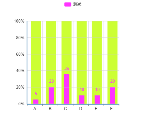
效果图:
echarts 代码如下:
var option = {
                tooltip: {
                    show:false,//鼠标移动不显示数据

                    formatter:"{a1}<br/>{b1}:{c1}%"
                },
                legend: {
                    data:['测试']
                },
                xAxis: {
                    data: ["A","B","C","D","E","F"]
                },
                color:['#ff33ff','#ccff33'],//柱图颜色
                yAxis: {
                    axisLabel:{
                        formatter:"{value}%"
                    }
                },
                series: [{
                	tooltip: {
                		show:false
                	},
                    name: '',
                    type: 'bar',
                    z:"-3",
                    barGap: '-75%',
                    barMaxWidth:'50',
                    data: [100, 100, 100, 100, 100, 100]
                },
                {
                    name: '测试',
                    type: 'bar',
                    barMaxWidth:'15',//柱图宽度
                    z:"-2",
                    itemStyle: {
       normal: {
        label: {
         show: true, //开启显示
         position: 'top', //在上方显示
        }
       }
                    },

                    data: [5, 20, 36, 10, 10, 20]
                }]
            };
接下来在报表中新建报表文件–单元格右键,选择第三方图形使用通用的 js 模板:
<div id='${id}' style="width:${width}px;height:${height}px"></div>

<script type="text/javascript">

//使用

require(

\[

'echarts',

'echarts/chart/scatter'

\],

function (ec) {

//基于准备好的dom,初始化echarts图表

var myChart = ec.init(document.getElementById('${id}'));

var option = {

};

//为echarts对象加载数据

myChart.setOption(option);

}

);

</script>
将代码中 option 部分替换到模板中,并且将模板中 require 中的图形名和 js 中 require 中的图形名保持一致即可.